
The Mercury Theme launched in 2022 with the homepage redesign, featuring all new content blocks to build with
During the lifecycle of the previous theme, there was a noticeable absence of a resource that allowed both internal members of our office and external users of our content management system to easily access and explore all available components available to them. As a result, a lot of time was spent (and wasted) searching for applicable content types at the onset of every new project.
At the start of a new project, we'd set out to mock up a wireframe for our developers. Our goal was to reuse content types to save the developers time and resources, but we had no pre-existing visual library of available content types to leverage.
Often times, our path to success looked something like this: begin researching for a project → discover a need to display a bit of information in a particular unique style that a developer remembers building at one point → hunt down the specific style somewhere within the 200+ projects we've developed → find a site where the style is used → go to the site in our content management system and find the name of the content type → include the content type name in our mockup to help our developers find it once they start building. What a headache... 😪
Of course, not every pattern we sought out to use was some unique, hard-to-find content type, but it happened frequently enough that we knew we needed a better way to document and keep track of our work. Even simple content types often had unique names that required some small amount of institutional knowledge. This is where we arrived at our solution.
We created the pattern library and Figma design system to document the components within the new theme, support collaboration amongst ourselves and clients, and ensure consistency in the quality of our team's output.

A screenshot of the Mercury Design System UI Kit, with the organization scheme shown in the left sidebar
At the outset of the project, two critical navigational structures required organization. First and foremost, we conducted a thorough taxonomy review for the component list, determining how best to categorize each element. While the pattern library primarily took shape under the guidance of our Senior Designer, my role involved creating animated and high-quality thumbnails for the pattern library components and leading the development of the design system.
At the same time, we faced the task of establishing a cohesive organizational framework for the design system. This involved thoughtful deliberation and collaboration among our design team to ensure that the system's structure aligned seamlessly with our overarching goals. This strategic planning phase was essential to ensure that the organizational structure would be intuitive for both our team and external collaborators.

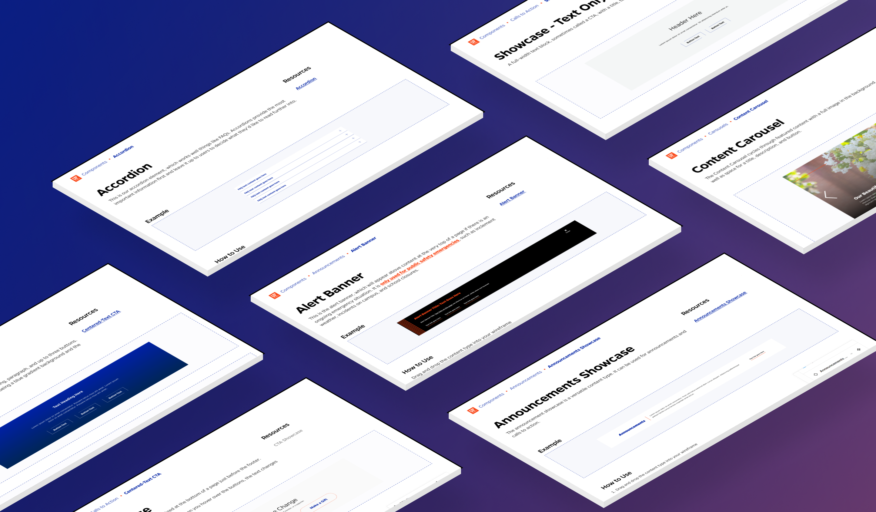
A screenshot of a component frame from the UI kit
The foundational step in establishing the design system was filling it with our core visual styles. I began by adding in a comprehensive list of visual styles into the framework, covering everything from text styles to color palettes and icons. This served as the foundation for all visual styles within the design system.
Next, I combed through each component, looking for the smallest pieces to create first, or the atoms. These atoms represent the fundamental building blocks of our design system, ranging from buttons and text links to icons and typography variations. My goal was to ensure that no detail was overlooked, making sure that the design system provided an exhaustive and versatile toolkit for our team.
By meticulously curating these elements and aligning them with our established visual styles, I ensured that the design system could serve as a comprehensive resource that allows our team to create consistent, visually cohesive, and accessible digital experiences.

The current Readme page for visitors to the design system
This project is one of passion and not obligation, so now that it's released, I have taken steps to ensure that we have a clear pathway guiding it's development with deadlines and goals.
I developed a one-year roadmap involving monthly updates to the kit to account for any components that need bug fixes or modifications. Cards have been set up to track bugs found between each monthly update and keep track of planned feature updates.
There will also be two feature updates between 1.0 and 2.0. We plan to release built-in annotation components and improved carousel components. Then, on the version 2.0 update, we'll release the mobile breakpoint of each component, as we only support desktop in version 1.0. My plan is to leverage Figma's variables system to accomplish this.
For now, my current focus is on thoroughly testing the components in internal projects, adding documentation to guide other designers through the use of the document, and gathering valuable feedback from users to add to future updates.
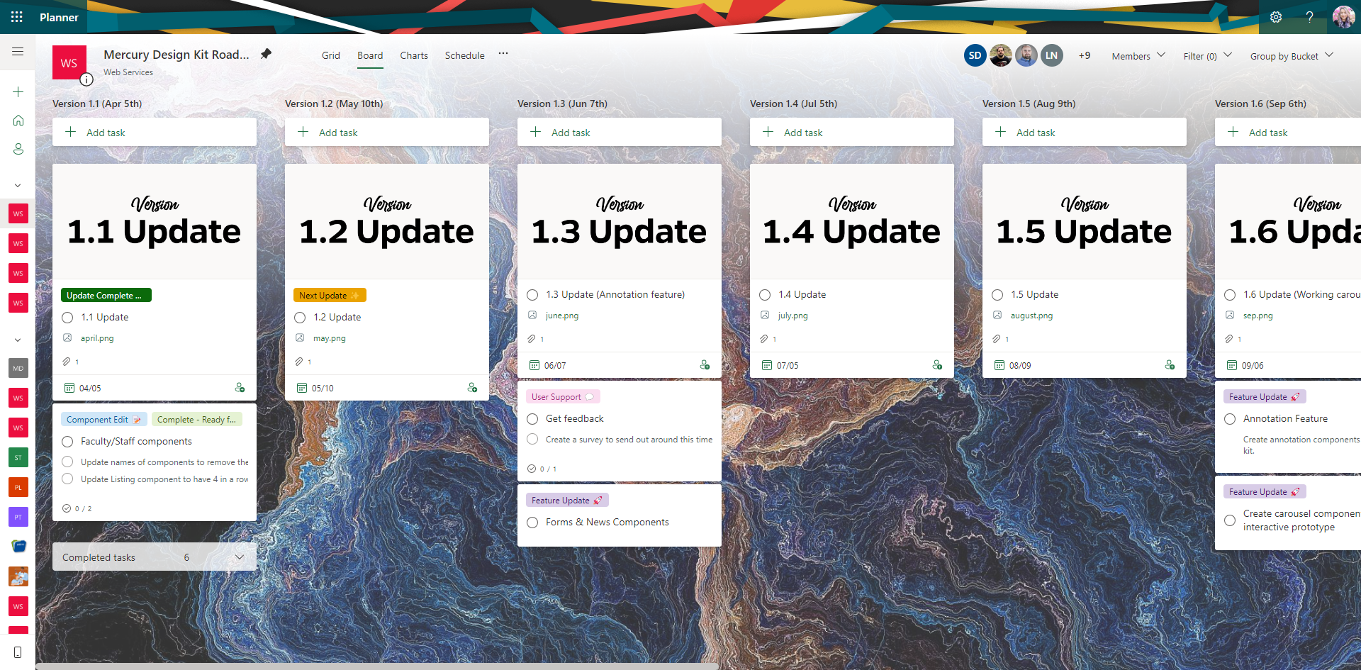
The 1-year Roadmap for the Design Kit
